File talk:Elements.gif
From A KoL Wiki
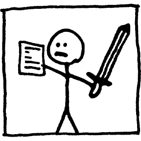
Okay, I think this image really needs to be changed. The hand-drawn lines from MS Paint simply look sloppy. I have uploaded Elements.png, which is an image I created with my Paint skillz, and I also noticed that someone uploaded Elements2.gif, which is also a pretty nice image. I couldn't decide. Whomever reads this, which image do you think is better, or what could be done to improve any of the mentioned images? --DestroyerBEACON 12:38, 16 February 2006 (Central Standard Time)
- We use that one because that is the one that Jick posted in the forums I believe. -TDG 22:15, 16 February 2006 (Central Standard Time)
- That's right. Hand-drawn lines look sloppy? We're talking about KoL here. It's supposed to look rough. Oh and I think it's charming. O_O --NewZorkBat 03:02, 17 February 2006 (Central Standard Time)
